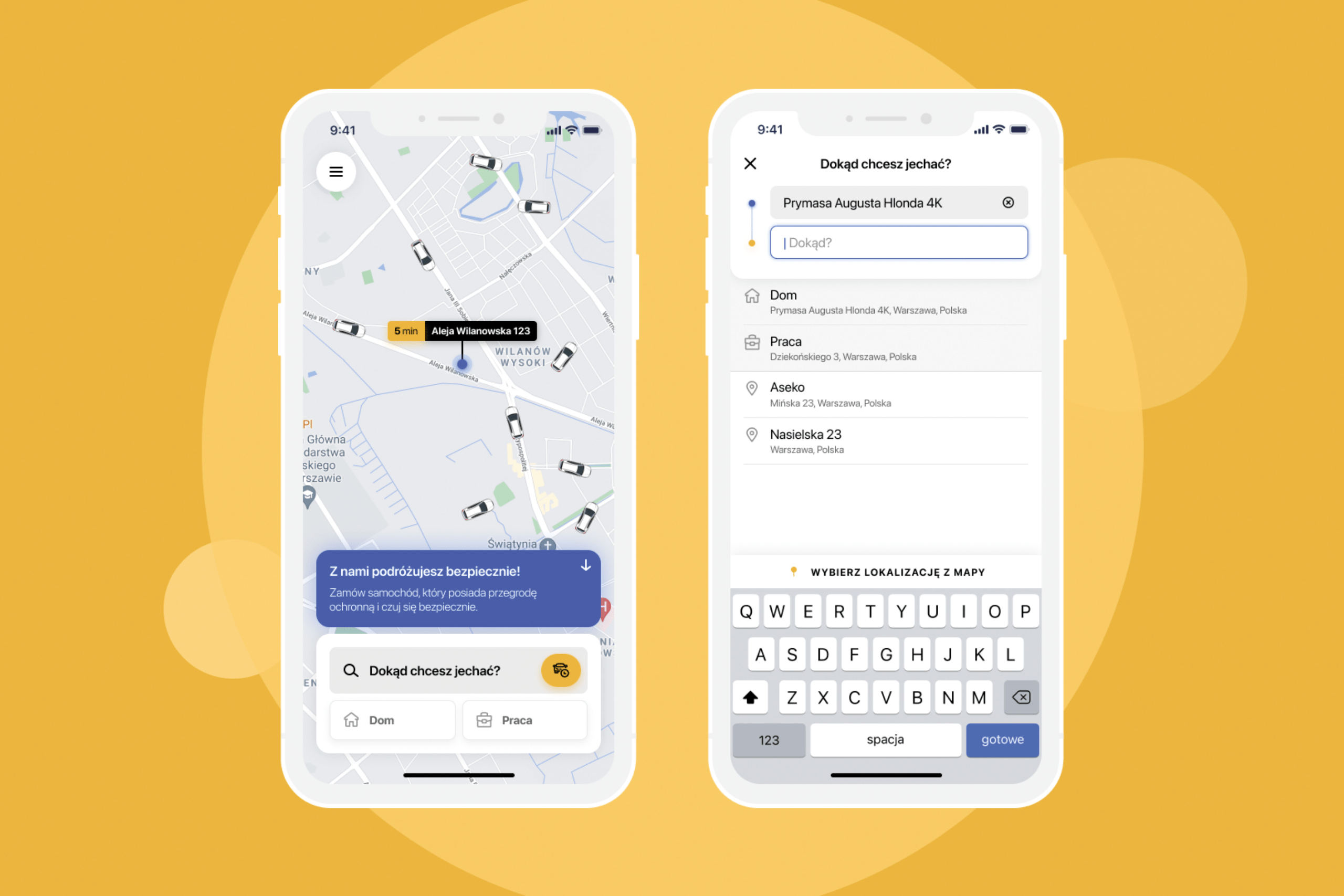
The iTaxi app had undergone several technological changes over the years, meaning that multiple issues needed to be addressed. In previous releases, backend changes were implemented by adding layers. That meant that first of all, we had to tidy up the structure before focusing on simplifying access to the app’s functions. We also had to review the user experience (UX) and redefine user actions – for a clear, streamlined passenger experience and improved usability.
Our task focused on addressing private users as a target group to attract and retain them as iTaxi customers. To avoid losing them in a process it was necessary to simplify and shorten the user interface processes. Changes to the app architecture were required to enable this: from new user registration through to booking a ride. For the latter, we defined a list of “hot topics” i.e. a list of the most frequently visited locations, which is accessible immediately after logging in. Redundant buttons and user steps were removed and replaced with new, intuitive solutions.
In total, the current ordering process accounts for only 20 percent of the time spent by users in the previous version of the app.
The start page is now designed for both business and private customers. The jumble of pins indicating available cars on the in-app map has been removed and replaced by clear pictograms.
A logged-in user can now order an iTaxi in just two clicks.
Our services:
- UX design
- Graphic design
- Prototyping
- Functionality tests
- Product development


